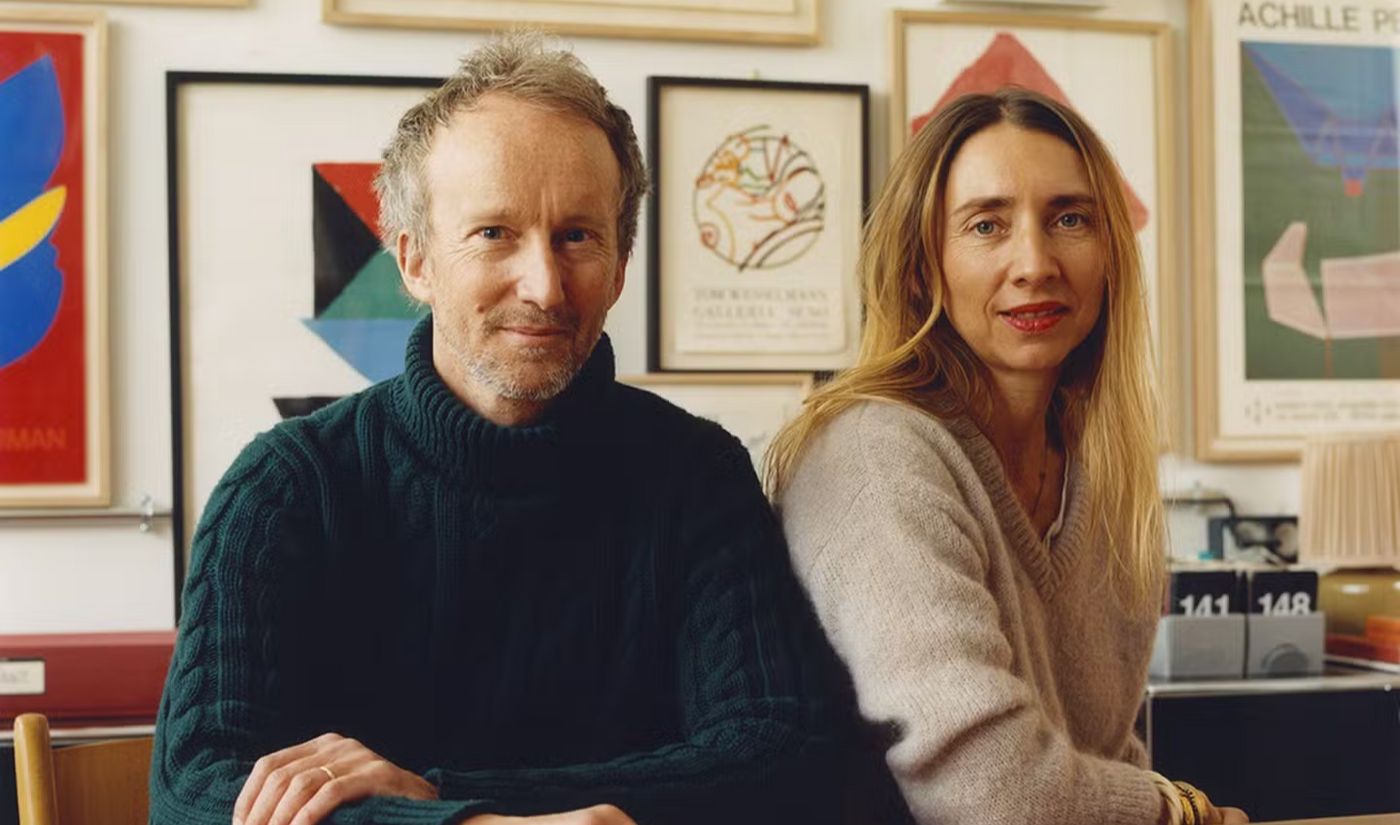
Meet Antoine Ricardou, the designer of ZAG skis

ZAG x SAINT-LAZARE
A long-standing partnership
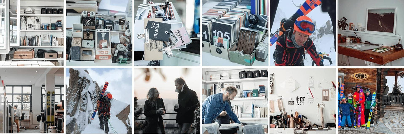
Since 2013, ZAG has been collaborating closely with the Paris-based design studio Be-Poles, which became Les Ateliers Saint-Lazare in September 2021. Renowned for its work with leading brands, we’ve taken a deeper look at the contributions of Antoine Ricardou — the agency’s founder and a key creative force behind many of ZAG’s projects, product lines, and collections.
For the last 8 years now, every year a meaningful story has been written on the top-sheet of our skis. Today we're going to dive into the world of Antoine, master in the art of narrative design.
What motivates you in your work?
A. R. — I love so many aspects of my work, but I think what drives me most of all is the narrative work that revolves around a brand. For me , design should tell a story and convey the brand’s intentions. It’s a task I really enjoy because it requires me to understand and immerse myself in the brand’s values and imagery in order to create a cohesive design for them.

How long have you been working with ZAG? How did you come to work with them?
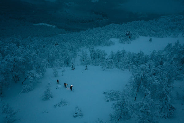
A. R. — I’ve been involved in the project since 2013. It actually happened in a pretty funny way—I was just chatting with a friend who’s close to the brand, and he casually mentioned one day that ZAG SKIS was looking for a design agency for its products. As a huge mountain enthusiast who was already familiar with the brand, I immediately wanted to be part of the adventure! For me, it was a project full of meaning because it would connect my work with my passion for the mountains. It was a no-brainer—I immediately stepped up to contribute! It’s essential for me to be able to identify with the history and message of the brand I work with, and in this case, I didn’t even have to look!
What is the main difference between a ZAG ski from 15 years ago and one today?
A. R. — At first, I didn’t have all the pieces of the puzzle; I had to do a lot of research to piece together a coherent story.
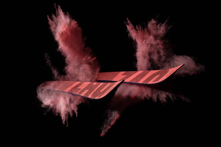
Of course, this was a gradual process, but we notably revamped the brand identity because we needed to ensure consistency across the project. So I focused my efforts and emphasized my work to ensure that a ZAG ski would stand out from the rest. This resulted in a unique graphic signature, ensuring consistency across the range and on the products. Of course, my primary goal was to reconnect the product with its natural environment—the mountains. So my teams and I immediately began working on this “color block” concept.
Color blocking is essentially a visual merchandising technique that plays with contrasts and spatial arrangement. This approach to arranging blocks of color is then used to entice, attract, and guide customers toward a specific product. Departing from this primary purpose, Antoine made extensive use of it, focusing first and foremost on the environment in which the products would be displayed.
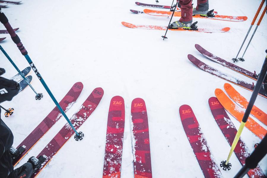
A prominent feature of ZAG skis, these vibrant graphic cross-hatches were designed to stand out against the natural, bright, and uniform backdrop of snow. Safety was also a key consideration. Since ZAG skis are intended for freeriding—a sport that involves risks—having a colorful, reflective base on base be spotted more easily when they cross their skis to signal their position.
Now I feel that there’s a real sense of coherence to the ZAG project, and it’s working well!
We see that you’re working on a wide range of projects—what do you like about the project with ZAG? Do you draw on elements from your other projects for this one?
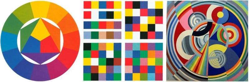
A. R. — It’s true that I work on a wide variety of projects, but color is a recurring theme in my work. Inspired by great artists such as Johannes Itten, Joseph Albers, and Sonia Delaunay, I focus primarily on color and typography.
The best part about working with ZAG is that I get to research a field that really resonates with me—a world I absolutely love to explore in my free time! I never go on a single ski trip without taking a good look at my skis and reflecting on the results of my work and the new ideas that might come to mind.
What kind of touch would you like to add to the skis?
A. R. — “When I design a ski, I naturally try to tell a story through the product.”
How did you create ZAG's graphic charter?
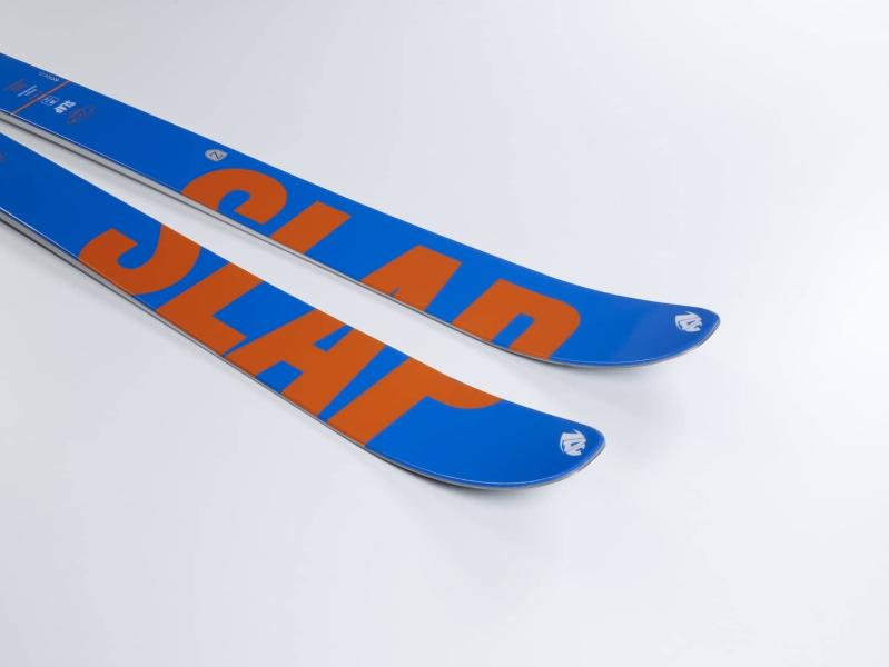
A. R. — My guiding principle is that design should be functional! For it to be functional, you have to make the most of the available space. Although the skis are wide, they don’t cover a very large visual area, so I decided to place the logo in large type on both skis. One of the first skis to embody this graphic style was the SLAP. It served as a unifying element for all the other skis that followed.

Can you tell us about the "Multi Tracks Finder" logo?
A. R. — The idea was really to come up with a logo that, like the rest of my work, would be consistent with the brand’s history and environment. Since ZAG is a ski brand, I tried to figure out what kind of tracks the products might leave behind. That’s when I had the idea! Although I didn’t choose the brand name, the Z stands for “Z of the month,” meaning the turns made while ascending.
The "G" stands for the wide turns you can make on a beautiful snow-covered slope. The logo consists of three lines, hence the name "Multi Tracks Finder." These lines represent the tracks left by skiers skiing in a line, all moving down the slope in parallel.
The idea is really that whether you’re going up or down, you leave your mark.It’s a logo that goes everywhere with you! We’ve added the city of Chamonix to the logo, which reinforces the brand’s identity within its natural setting!
What are your goals for creating a collection?
A. R. — First and foremost, I’m reviewing the functional brief from Bastien, the R&D manager. My role as a designer will be to bring to life the results of the research, engineering, and R&D work.
While design certainly serves a decorative purpose, it must above all be functional. Design is there to explain and complement the engineering work. For example, almost all skis feature their dimensions, weight, and the names of the shaper and model within a defined classification system.

How do you match colors on a pair of skis?
A. R. — I draw a great deal of inspiration from artists who have explored color both theoretically and intuitively. Among them are Sonia Delaunay and Johannes Itten. We rely heavily on artistic references and color associations.
How long does it take you to do a ski run?
A. R. — It can go quickly if I know where I’m heading, because it’s a constant process of reflection that doesn’t stop once the collection is created. Throughout the year, I reflect on my projects to improve them and evolve the design. The research I do beforehand allows me to be efficient and precise in what I want to achieve. With the help of a second person, I can easily complete the graphic collection in a few days. Once my designs are finalized, all that’s left is to make adjustments based on feedback.
How do you go about it? What are the steps?
A. R. — First, I consult my reference database, which I maintain throughout the year with images that I catalog and classify by color. It could just as easily be a pair of Nike shoes as a piece of neon-colored Gore-Tex or a bicycle.
I will then combine my ideas with the brand’s specific technical needs in terms of product presentation, marketing, and product design.
The process is therefore built around two stages: first, I listen to my intuition, and second, I refer to the brief provided by the brand. This allows me to always be innovative and not just follow a trend, but rather create one—it’s unique.

What do you consider to be a successful collection?
A. R. — When they sell! If a pair of skis isn’t selling well, it means we haven’t done our job. I ski on ZAGs, and so do my family and friends. People often stop me to talk about the skis. That’s how I get immediate feedback on the design. As soon as I see someone with ZAG skis, I go talk to them. We talk about design, of course, but also about skiability and performance. Design isn’t everything. You need a good product.
Speaking of the new collections, what can we expect?
A. R. — Overall, the design direction remains the same as before, but I’ve placed greater emphasis on the brand identity. At the moment, I feel the skis are still a bit too busy and could be simplified visually. We’ve therefore worked on revising the color schemes and typography.